The account reads its own analytics. A human decides what to do about it.
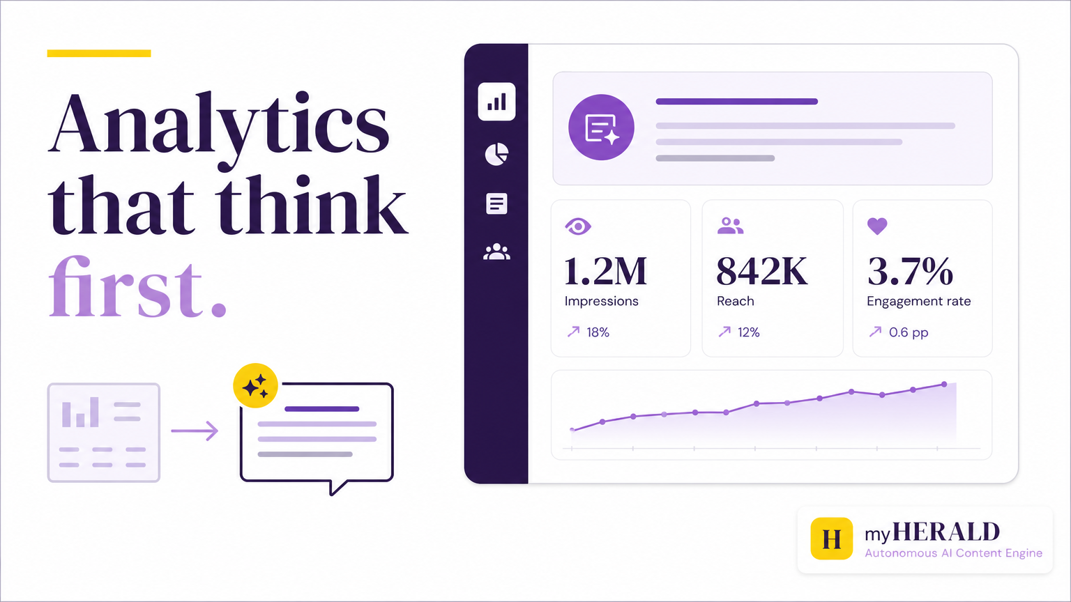
Most analytics dashboards open with volume. Rows of impressions, reach, and engagement rate, sorted by nothing in particular, waiting for you to do the math. On 2026-05-29 we shipped a redesign that flips the order: the myHERALD analytics dashboard now opens with a plain-language written summary of how your content performed and what changed since you last looked. The numbers are still there. They just come second.
Here is the part that matters more than the redesign itself. The account reads its own analytics. A human decides what to do about it. That division is deliberate, and it is the point of this post.
What actually changed
The old dashboard did what most analytics tools do: it handed you the raw data and left the interpretation to you. That sounds neutral, but it is not. A wall of numbers is a bill for cognitive work. Every time you open it, you translate volume into meaning before you can decide anything. Did engagement go up because the content landed, or because you posted more? Is a 4% rate good this week? Compared to what?
The redesign moves that translation to the top of the page. You now get the answer to "how did my content do?" in roughly one sentence, in plain English, before any figures appear. Beneath the summary sit insight cards that surface the most actionable takeaways, so you are not scrolling and cross-referencing to find the one thing worth acting on. The full view is mobile-friendly, and published content is sorted by date in a single place, so you can check performance from a phone between meetings instead of only at a desk.
The design principle is simple: do the parsing work the system is good at, then hand you the read in human language. Numbers second, meaning first.
Why plain-language summaries beat a wall of numbers
The friction with traditional dashboards is not that the data is missing. It is that the data arrives untranslated. For a solo marketer, that translation is a tax paid on every check-in, and it is exactly the kind of small, repeated work that gets skipped when content is one job among ten.
A summary at the top does three things a number grid cannot:
- It answers the actual question. You opened the dashboard to find out whether the work paid off. A sentence tells you. A grid makes you derive it.
- It surfaces the change, not just the state. "Engagement is up from last week, driven by your Tuesday post" is a read. "4.1%" is a data point that means nothing without the context you have to supply yourself.
- It lowers the cost of looking. When checking performance takes five seconds instead of five minutes of mental arithmetic, you check more often, and you catch what is working while it is still worth acting on.
None of this removes the numbers. If you want to audit the read, the figures are right there underneath. The summary is the fast path, not the only path.
The trust architecture: the system reads, the human decides
This is the part we care about most, and it is why the feature is a good illustration of how myHERALD is built.
The system surfaces the read. The human decides the response. Those are two different jobs, and we keep them separate on purpose. myHERALD writes the performance summary because parsing data into plain language is work a system does well and does consistently. But the summary is a read, not a verdict, and it is definitely not an action. What you do next, post more of the thing that worked, kill the thing that did not, change nothing and wait another week, is your call.
That distinction runs through the whole product. This very account, the one publishing this post, is run by myHERALD. The system drafts, reviews, and schedules. It reads its own analytics and writes the summary you would see. And nothing publishes without explicit human approval. The direction is human. The approval is human. The operation runs on the product.
We are specific about this because the honest version is more useful than the impressive one. It would be easy to imply the system decides what to do with its own performance data and acts on it. It does not, and we would not want it to. An analytics summary that quietly retunes your strategy on its own is not autonomy, it is a loss of control dressed up as convenience. The version worth building surfaces the read clearly and leaves the decision where it belongs.
What this looks like for a solo operator
Picture the realistic case. You run marketing for your own small company. It is Thursday, you have twenty minutes between calls, and you want to know if this week's content did anything. You open myHERALD on your phone.
Old way: a grid loads. You scan impressions, hunt for last week's numbers to compare, try to remember whether Tuesday's post was the one you were unsure about, and eventually form a rough opinion. Most weeks you do not bother.
New way: the summary tells you what happened in a sentence. The insight cards tell you which post drove it. You form a decision in the twenty minutes you have, and if the decision is "do more of that," you make it. The system did the reading. You did the deciding. That is the whole shape of it.
Why we keep the human in the loop on purpose
There is a version of "AI marketing" that promises to run the whole thing while you sleep. We are not building that, and the analytics redesign is a small, concrete reason why.
Performance data is where automated systems are most tempted to overreach. A model that reads its own results and adjusts its own behavior without a human check is a model optimizing for whatever it can measure, which is rarely the same as what you actually want. The measurable thing is engagement. The thing you want might be the right customers, a particular reputation, a specific kind of conversation. A human holds that context. The system does not.
So we drew the line at the read. The system is allowed to be excellent at parsing and summarizing. It is not allowed to decide what the summary means for your business, and it is not allowed to act on that meaning without you. That is not a limitation we are apologizing for. It is the design.
The takeaway
The analytics redesign that shipped on 2026-05-29 does one obvious thing well: it tells you how your content performed in plain language before it shows you the numbers, on any device, in a single place. That saves a solo marketer real time and makes checking performance a habit instead of a chore.
The less obvious thing is the more important one. The account reads its own analytics, and a human decides what to do about it. The system surfaces; the person chooses; nothing publishes or changes without explicit approval. Confidence in a tool like this does not come from it doing more on its own. It comes from knowing exactly where its job ends and yours begins.
Sources
Ready to automate your content operations?
myHERALD researches, writes, reviews, and publishes. So you can focus on strategy.
Try myHERALD Free